Sustainable E-shop concept
Company
Zero Waster Zone
Pages designed
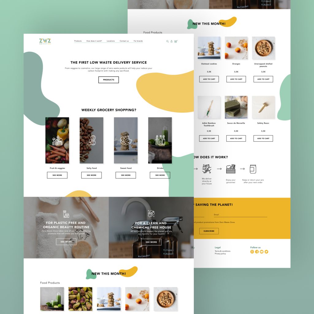
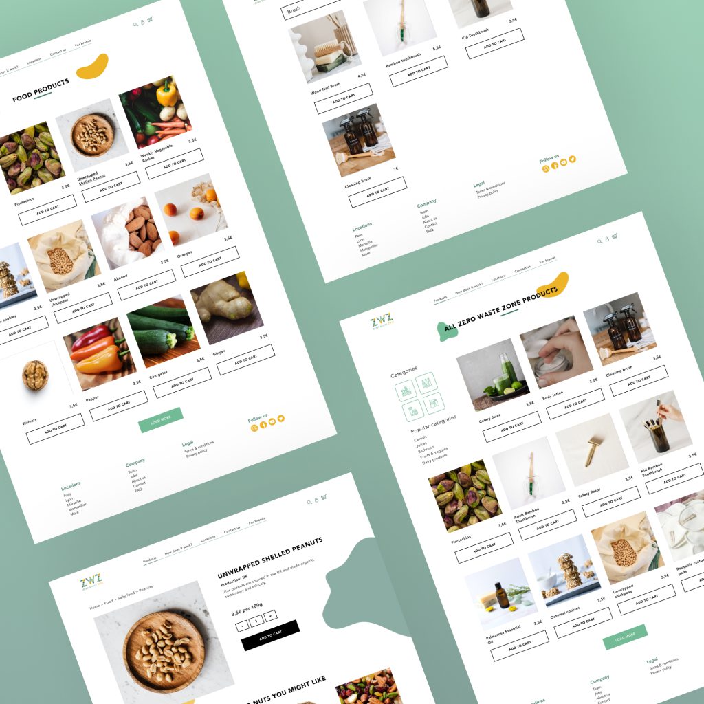
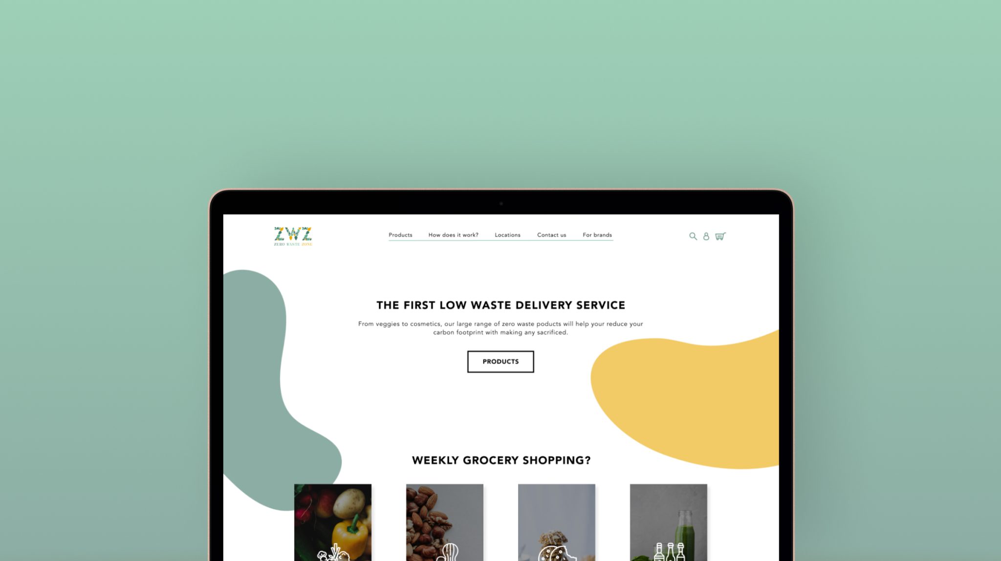
Home page - Shop page
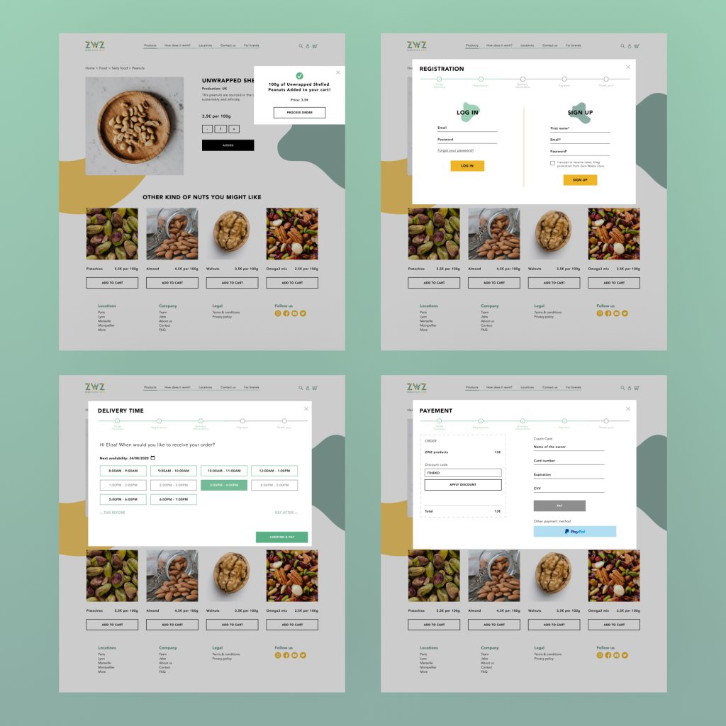
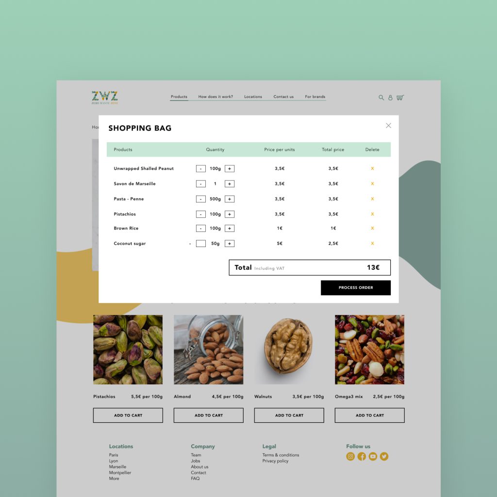
Search page - Checkout pages
YEAR
2020
ABOUT THE Company
Zero Waste Zone is your gateway to a sustainable online delivery service. Committed to environmental responsibility, they provide a curated selection of eco-friendly, reusable, recyclable, and compostable products. From fresh produce to cosmetics, their diverse range is designed to meet the daily needs of environmentally conscious consumers.
ABOUT THE PROJECT
Back in 2020, I got to play around with the design for Zero Waste Zone. The goal? Make it a breeze for you to shop responsibly. An online store where you can hop from veggies to your fave shampoo, all while feeling good about it. No eco-jargon, just straightforward, easy shopping.
Problem To solve
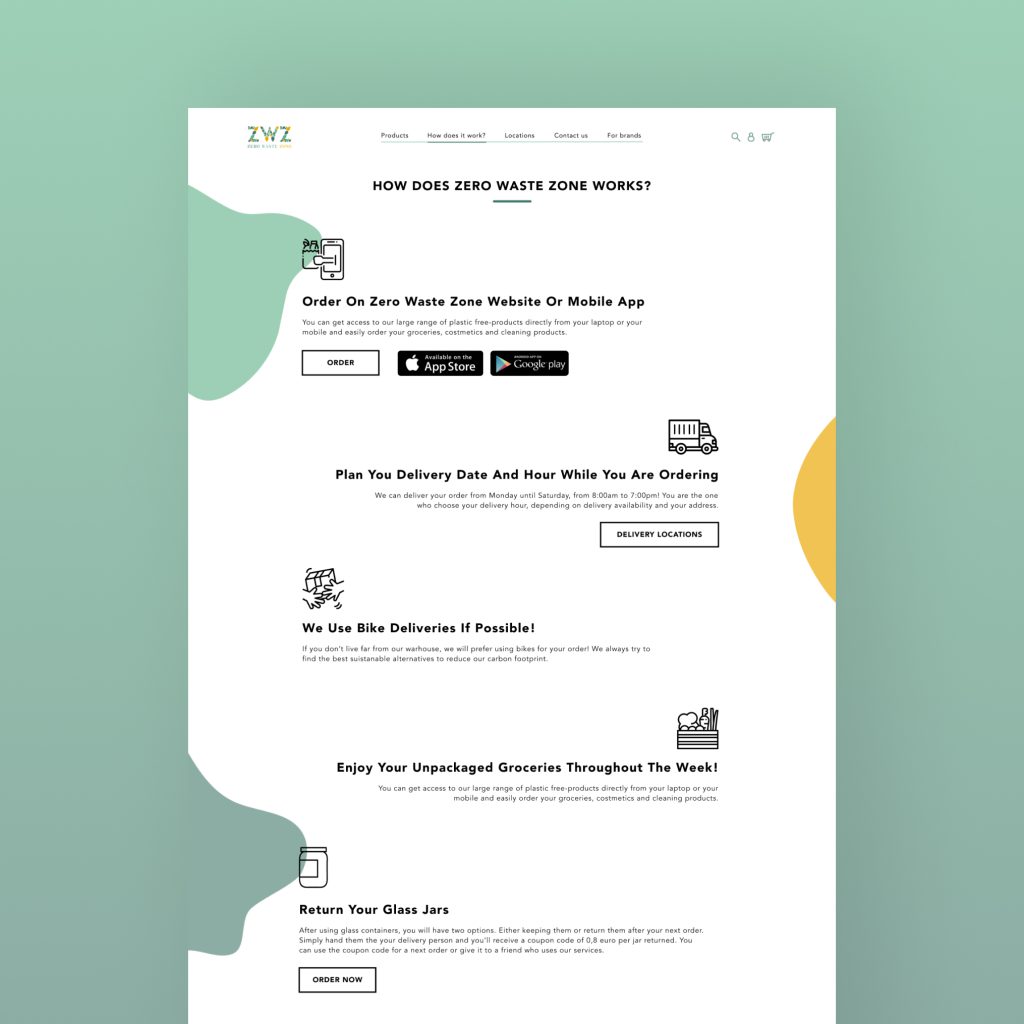
Managing a vast SKU inventory demanded efficient product categorization. The user interface optimally balances this complexity, presenting a clear, intuitive path for users to traverse. While eco-friendly services are gaining traction, our design ensures users grasp our distinctive approach and service availability.
My role
UX -UI Designer
KEY Results
In my capacity as a UX-UI Designer, I sought to bridge functionality and sustainability. The design seamlessly integrates features for easy navigation, transparent communication of our service model, and a user-friendly interface for brands seeking collaboration.
